fbpx
paints, home painters
Written by Colleen Kalil

Choosing A Paint Palette For Open Floor Plans

paints, home paintersOpen concept floor plans continue to be a favorite among homebuyers. The flow from room to room creates a large, inviting space for friends and family to gather, and without walls separating rooms, the area feels larger and more spacious. However, the large space can present decorating challenges. How do you create a unified color scheme? Use too many colors and the space will feel chaotic and be visibly unappealing. Use too few colors and it may be boring.

One option is to create a palette using three to five colors. Five colors may sound like a lot, but the key is how each color is used throughout the space. Choose one neutral color: white, off-white, or eggshell are good choices. Next, select one or two other light colors, and finally, select one or two accent colors. Keep your choices within color families to create a sophisticated, professional appearance. Whichever colors you choose, be consistent when applying them to your rooms.

Use your neutral color as a base and apply to the majority of the space. The neutral color provides a blank canvas where you can add different accents, textures, and materials. Add interest to different areas of the space with an accent wall. Don’t be afraid to be bold. Remember, dark colors make objects recede, light colors make objects look bigger. Add color to the inside of a built-in bookcase, the wall over a fireplace, or an interesting architectural detail.

A three color palette is a simpler plan. Use one color for the walls, the second for the trim, and the third for the ceiling. Again, make sure colors coordinate to create a refined interior.

Tone-on-tone or monochromatic palettes offer more variety than you might think. Use different tones of the same color, either in one room or as a smooth transition between rooms. The different tones don’t have to come just from paint. Add wallpaper, stenciled designs, fabric, glass tile, etc. to create interest and texture.

Don’t forget that textiles and furniture are part of creating a cohesive space. If you’re a fan of hardwood floors, select a neutral that works well with your color palette and furniture style. Layer area rugs, architectural details, and artwork to create depth and add interest to your space.

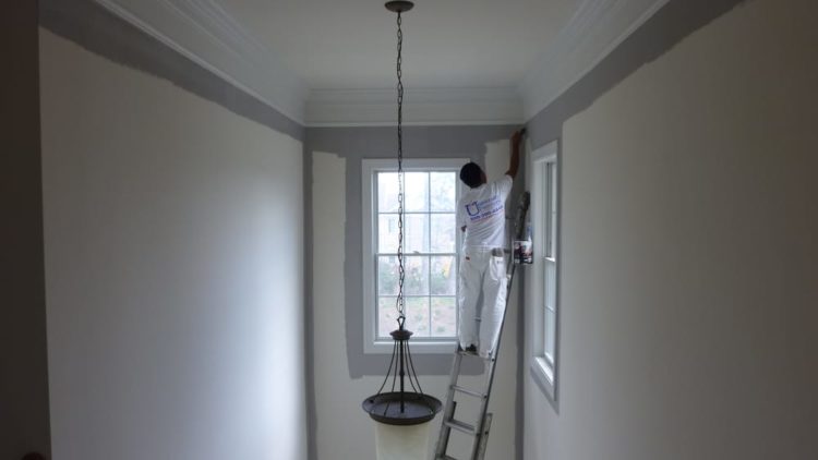
University Painters expert technicians can help you develop the right color palette to create the mood that’s right for your home. Call us today for more information and to set up a free consultation.

Exterior Painting, Home Painters
Written by Colleen Kalil

Get Your Backyard Event Ready

During the warmer months of the year, people want to spend more time outdoors, not just relaxing but also celebrating with friends and family. Whether the gathering is a casual barbeque, a child’s birthday party, or a wedding, everything should look fresh and inviting.

If your home has been the same color for the past decade, consider giving the exterior a refresh with a new combination of colors. Every year, the people at the Pantone Color Institute select a color of the year, which influences the fields of fashion, design, and home décor. The color for 2018 is Ultra Violet, and while the exterior of your home may not be the place for a pop of this vibrant color, there are other palettes that are currently trending.

Before painting, consider the environment around your home. Do you live in a wooded area, downtown, or a more traditional suburban setting? How will the new color fit in with other homes in your neighborhood? The answer to these questions will help you choose the best color scheme for your home. The first step is to select the main color, and then add accent colors. Don’t go overboard with the number of accent colors or you may end up with what looks like a Jackson Pollock painting rather than a fresh, updated exterior.

Exterior colors now trending are gray-blue, pale yellow, Cyprus green, peach, forest green, and red. If you select a bold color like red, keep the trim simple and add a complementary color to the front door. If you absolutely love white as the main color for your home, try updating the accents to forest green, gray-blue, or navy blue. If you live in a lush, forest environment, yellow or peach are options to make your home stand out but not overpower the flora.

If you have a few ideas but need help making your final color choices, contact University Painters. We can help you develop the right color palette for your home. Contact us today so we can help you get prepared for your next backyard event.

painters, paint colors, interior painting
Written by Colleen Kalil

4 Color Themes To Make A Small Room Appear Larger

interior painting, painters,paint colors has the ability to make a room appear larger or smaller. The right colors can make even the smallest rooms seem bright and airy. By pairing bright hues with contrasting darker shades, you can instantly add space to your room.

White With Accents

White rooms are easy to work with because they look good with any accent color. You can pair it with dark and dramatic colors. You can paint a white accent wall without making your room look tiny.

Don’t be afraid to experiment with color. Try a black-and-white checkerboard wall. Paint coral and turquoise for that touch of beach flavor or paint an entire wall fire-engine red or cobalt blue. As long as the other three walls are bright white, your room will look large and spacious.

Sunny Cheery Colors

Yellow and orange are great additions to small rooms. The best shades to use are soft yellow, pale yellow, butter, lemon, or banana. When it comes to orange, use sherbet or pastel orange. It’s better to use these colors with dark tones if your room is narrow.

Paint your wall with vertical stripes. This will create the illusion of a longer room. Add some fun color elements with lime green and sorbet orange.

Under The Sea

This next idea is great for a children’s bedroom. Sea foam green, light blues, and soft greens are relaxing colors that enlarge your space. Plus, you can mix them with reds, corals, blues, whites, and other colors. Paint your accent wall emerald green or forest green for that pop of color.

Blue is another color that helps widen a room. It looks great with white walls and light carpeting. Keep your window treatments and trimmings white to add more space to an already small room.

Easter Egg Colors

Pastel colors aren’t reserved for spring and kids. These hues can make any space appear bigger. Use touches of lavender, lilac, soft pink, baby blue, mint green, and peach. Break up the colors by painting your walls beige, tan, or cream. Paint your door and window frames in similar neutral tones.

Add accents to your room with darker shades in the same spectrum. Some fashionable accents include rugs, blankets, and throw pillows.

That’s not all. Use plenty of natural light and mirrors to help open up the space in your room. Don’t want to do yourself? University Painters have years of expertise when it comes to interior painting. Call us today to add a fresh coat of paint to a space in your home.

painters, interior painting
Written by Colleen Kalil

What Colors Should You Paint The Nursery?

One of the most exciting things parents do before the arrival of a new baby is prepare the nursery. Unfortunately, parents are often stuck between choosing between pink or blue when deciding what color to paint the nursery. Unfortunately, these two colors are not always the best choice. There are other options and paint colors that you can consider. Here are some tips to help you get started:

Think Long Term

Your baby may love pink now but it will not take long before your little one will grow up and have a change of heart. To create a look that lasts, put aside the traditional pastel colors and opt for a more sophisticated color scheme. You can try a navy, coral or minty green. You may also go for a rich and neutral shade that you can complement with updatable accent colors.

Consider How Colors Can Affect Your Little One

Colors can have influence on your child. According to the science of psychology, colors can significantly affect the mood, behavior and physical well-being of children, so keep this in mind when choosing colors for the nursery. For a start, choose colors that can help soothe your baby. These hues include muted greens, subdued blues, soft whites and pale purples.

Settle On A Style Or Theme

If you have a hard time choosing colors, you may want to select a style or a theme instead. A theme can evoke a specific color. A pirate theme, for instance, entails an ocean-inspired blue. Choose a theme that you like and let your imagination guide you.

Get A Well-Balanced Color Scheme

Do not overwhelm the nursery with an array of colors. Limit the selection to a single primary shade and two accent colors at the most. Feature each shade several times throughout the space and aim for at least three uses per color. This can help create continuity that can ensure a flowing and well-coordinated design.

Remember that colors can look different once they are painted on the wall so before painting the whole room, consider taking home a sample and painting a large swatch to see for yourself how the paint will look in the nursery. It is also a good idea to entrust the painting job to a professional with years of experience in the industry.Contact us at University Painters to learn how we can help you prepare the nursery for your little one.