Color Trends for 2018-2019
 Have you ever walked into someone’s house and thought, “That color is so 1970s?” It’s easy to tell the last time a home was painted based on the color palette. While some colors are timeless, there are definite trends in color families, hue, and tone. Read on for the hottest colors for 2018 and 2019.
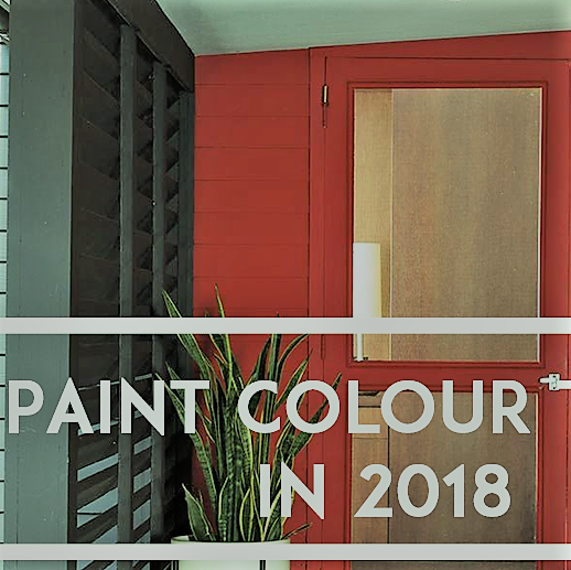
In House Beautiful’s May 2018 issue, the top five color trends for interiors were Sage, Gold, Ultra Violet, Crimson, and Teal. Bold colors are in, and it’s your chance to experiment. If you’ve never had anything except white walls, try something new. Select one, two, or more colors you’d like to try and paint a 2′ x 2′ area on the wall. Paint color often dries darker than it appears in the can. You’ll also want to see it at different times of the day.
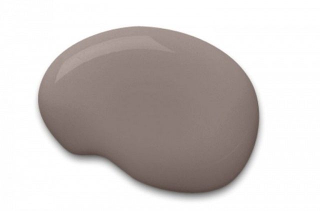
Trends for 2019 are a bit more subtle, but they’re still not typical. Hazelnut, Lilac, Gray, Dark Green, and pastels are at the top of the list for color choices. The choices you make will depend on the style of your home, the room’s purpose, and your personal taste. Color psychology is a great way to guide your choice.
Colors in the red-orange family are warm and stimulate Purple your senses. While reds are associated with danger or caution, they convey power and energy. Orange is also energetic but in a lighter way than red. Yellow has a feeling of joy, brightness, and happiness. Children whose favorite color is yellow tend to be happier and more positive.
Blue and green represent nature, freshness, and growth, but also stability and safety. Most shades of green are calming colors, good choices for bedrooms or the living room. The lighter the colors in this palette, the more soothing the effect.
The color of royalty, purple has gained in popularity over the last few years. Purple represents wealth, luxury, and creativity.
White is a timeless classic and ranges from bright white to eggshell. White symbolizes purity, goodness, and cleanliness. It’s an excellent neutral if your furnishings have busy patterns or bold colors. Be careful when choosing bright whites. Depending on the light source and lighting in your home, it can appear harsh.
No matter what your color preferences are, the experts at University Painters can help you select the right color for you and apply it to perfection. Call us or go online for an appointment.


