fbpx
Interior Painting, exterior painting,
Written by Colleen Kalil

Painting The Workplace With These Colors Can Make Employees More Productive

Interior Painting, exterior painting,Colors can affect job productivity. It’s time for an office makeover if your office walls are painted dull gray, the cold color commonly used in cubicles and concrete.

A recent study conducted by researchers from the University of Texas found that gray, white and beige offices can induce feelings of sadness and depression in women. Men, on the other hand, experience gloomy feelings in orange and purple workplaces.

The study shows that colors can profoundly impact people’s productivity. This means that offices and workplaces need to be painted and decorated with vibrant and stimulating hues to boost output and spark creativity.

What Colors Can Help Improve Productivity In Your Office?

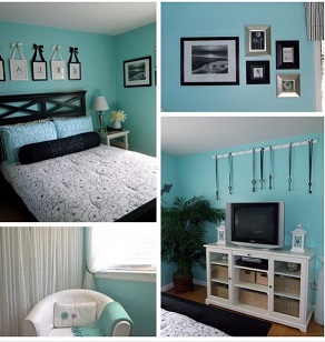
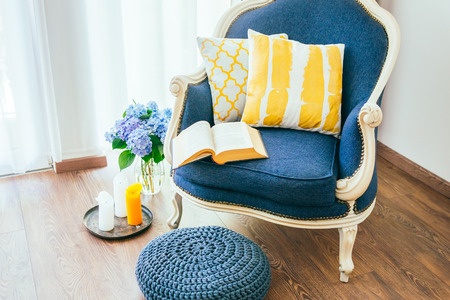
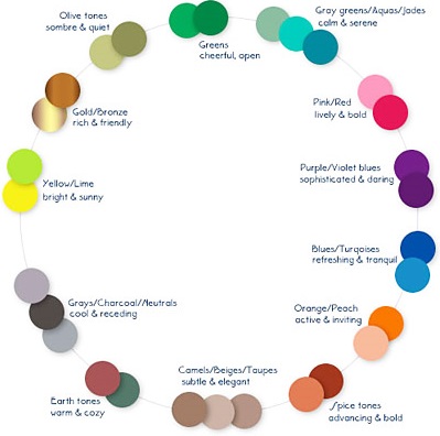
Low-wavelength colors, such as calming blue and restful green, improve efficiency and focus. They can also lend a sense of well-being. Paint your office with green and blue if you want happier and more effective workers.

For workplaces where people do creative thinking all day, color psychologists recommend painting the office with blue and spicing it up with a bit of orange to introduce some emotion into the room.

The color red, a high-wavelength color, is a passion-inspiring hue. This active and intense color, widely used during Valentine’s Day and on fire trucks, can increase heart rate and blood flow.  The red hue also stimulates physically. Use this color if you want your employees to be more productive in doing physical tasks.

Mellow yellow is often considered by color psychologists as the shade of optimism. This energetic and fresh color is believed to trigger innovation. It is best used in work environments where creative professionals, such as designers, artists and writers work.

Determining The Right Color To Paint Your Workplace

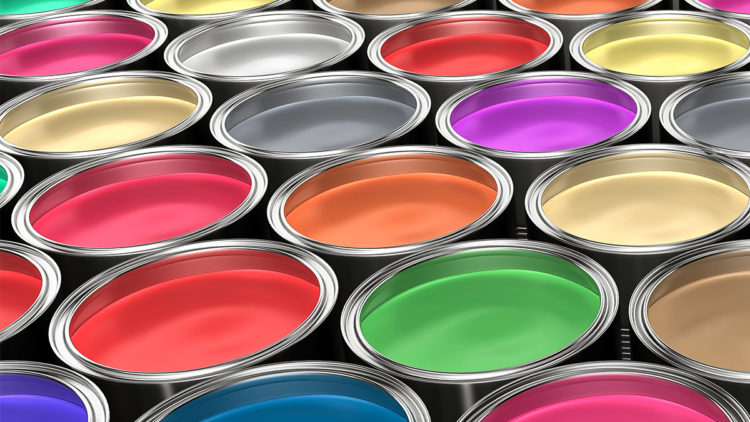
To determine the color that best suits your workplace, narrow down which main color or color combinations will work best in your situation. If you employ people who are hired to do manual labor, such as building houses, you would want something red rather than blue. If your company employs artists, you can have the workplace painted primarily in yellow to inspire creativity in your workers.

Hire a professional to do the painting job at your office. University Painters has years of experience painting offices, commercial buildings and houses. Contact us now to get a free estimate.

painters, painting interior, services
Written by Colleen Kalil

Avoid These Mistakes People Make When Choosing Paint Colors

It is crucial to make an educated choice when selecting paint colors for your home. You do not want to live in a home with colors that are either too boring or too overwhelming. Make sure to avoid the following mistakes people often make when choosing paint colors:

Failing To Take The Furniture And Decor Into Consideration

It isn’t a good idea to choose a paint color simply because it is your favorite hue. Consider all the elements in a room or your house when choosing a paint color. You do not want a paint color that clashes with your couch or favorite painting.

Read More
Interior painting, Home painters,, repairs
Written by Colleen Kalil

Most Common Causes Of Peeling Paint

Paint may start to peel off of interior walls or exterior surfaces of your home regardless of when it was applied. Here are some possible causes and how you can fix the problem:

Poor Adhesion

Paint will start to peel off when it does not adhere properly to the surface underneath it. This happens when the wall was not cleaned and primed correctly.

Mildew, oil, dirt and dust need to be thoroughly removed before painting. If you are painting a wall covered in old paint with a glossy finish, you must use an abrasive cleanser to clean and dull the wall to improve adhesion. If you are painting over a wall with an existing paint type, you need to choose the same type of paint. Oil, latex and water-based paints do not mix well together.

Moisture

The paint will not dry correctly if it is applied to a damp surface. This can lead to premature peeling of paint.

Paint That Has Gone Bad

Peeling can happen if the paint used has already gone bad. Latex paints may no longer be usable when they are left stored in open containers in the garage. They start to develop a strong odor and leave a rough finish on the surfaces that can cause peeling. Cheap paints may also fail and peel sooner compared with higher-end paints.

New Wood

New wood has natural oils that can cause paint to peel off regardless if the wood appears dry when you paint it. Cedar is particularly susceptible to this. Wood that was not properly cured may contain too much moisture.

A wall with peeling paint is an eyesore, as well as a health risk, since areas in your home with flaking paints can become a breeding ground for bacteria and mildew. Ensure you make the necessary repairs as soon as possible.

Fixing peeling paint requires removal of the chipped paint, use of a patching compound, sanding, then use of an oil-based primer.  An easier option to repairing peeling paint is to entrust the job to an experienced professional.

University Painters can help fix peeling paint in your home. Our expert painters can remove old and peeling paint layers then repaint the surfaces using tried and tested techniques that can prevent peeling from happening again. Contact us today to learn more about how we can help you repair peeling paints in your home.

[/fusion_text][/fusion_builder_column][/fusion_builder_row][/fusion_builder_container]

Painting Jobs, Home painters
Written by Colleen Kalil

Choosing The Right Paint Colors For Your Home

People often have a hard time picking out paint colors. Colors can transform your house into a home but the challenge for most homeowners is having to choose from thousands of available colors and picking the perfect one. Should you choose a dark or light color? Cool or warm? Neutral or bold? Here are some tips to help you pick out the perfect paint color:

Consider The Location Of The Room

There are several questions that you need to answer when choosing colors for particular spaces in your home. What is the purpose of the room you want to paint? Will the room serve as a dining area where you plan to entertain guests and spend time with your family every night for dinner? Will it be a laundry room, or will it be the master bedroom that will serve as your sanctuary after a busy day at work?

Different colors have different impacts. A pale blue, for instance, helps you feel relaxed so it is often painted in the bedroom. A bright color, on the other hand, can make you feel more active so you can use it in a work area.

Pick A Color Palette

Once you know the purpose of the space and what you want yourself and others to feel in this particular room, it is time to pick a color palette. Look around you. You should pick a color that goes well with everything in your room, You can also choose the color first then work around this color by accessorizing with curtains, decors and painted furniture.

See The Colors In Action

It is a good idea to give your colors a test before you proceed with the painting job. Paint the colors you’re considering onto white poster boards and place these next to your furniture, carpet and cabinets. Move the poster boards to different places in the room and look for color undertones at night in artificial lighting, during the day with natural lighting, and during rainy days.

Once you have chosen the colors for your home, be sure to choose a professional to perform the paint job for you. Feel free to contact us at University Painters to learn more about the house painting jobs we provide.

Interior painting, home painting
Written by Josh Jablon

Painting Your Walls With These Colors Can Help Relieve Stress

You do not have to travel far everyday to de-stress and relax. You can take a breather after a stressful day at work in the comfort of your home. Having the right home interior paint colors in your house has been proven to boost mood and help you relax, so you may want to consider the colors painted on your walls. You may want to switch to any of the following colors that can make your long and stressful day less overwhelming:

Blue

Blue is a soothing color that can calm your mind and reduce tension. It is frequently used in bedrooms because it helps people sleep. When choosing shades of blue, go for those that are soft, neutral and restful.

Violet

Violet stems from the color blue. The right kind of violet can bring inner peace and balance on your soul. Steer away from hues that have too much black in them though because these shades tend to create a cold environment.

Pink

Pink also calms and brings peace into a room. Feng Shui believers even use this color for soothing energy in a room. Pink may be considered a feminine color, which is why it is best used in girls’ rooms but the right tone can look beautiful in any room.

Green

Green is a symbol of nature. The color is also very visually soothing, which can help produce a feeling of freshness and calm. People find themselves more relaxed in places where they are surrounded by the colors of nature. You can bring this feeling inside your home by painting your rooms and walls with nature’s colors.

Gray

Gray may seem dull and boring for some people but this color can actually provide a soothing and cooling presence. It is also a neutral color so it easily works with most furnishings. It can be used in a variety of rooms including the living room, kitchen, home office and bedroom.

Getting the right colors for your home can help alleviate stress after a busy day at work. If you consider repainting your home for new colors that can help you relax, choose a painting service contractor with years of experience in the industry. University Painters has been providing painting services for houses and condominiums since 1986. Feel free to contact us for a free estimate of the painting job you have in mind.

Home Painter, Interior Painting
Written by Josh Jablon

Colors To Use And Avoid In Your Home

can influence people. The right color in your room can help you sleep better at night. Some colors, on the other hand, may have an unwanted influence on the appetite of people in the dining room. Here are the things that you need to consider if you’re planning to give your home a new set of colors:

Bright Colors

Vibrant shades of green, yellow, blue and orange are happy colors that encourage communication and provide an expansive feeling. These colors are great for the dining area and the kitchen.

Dark Colors

Dark colors such as dark shades of green, purple, red and blue give a constricting and gloomy effect. Given the right accent elements and applied in the right place though, these colors convey feelings of comfort and security.

Warm Colors

Warm colors such as orange and yellow hues elevate the perceived temperature of a room, which makes them ideal for spaces that face north. These colors also inspire activity so avoid using them in rooms where you go to relax, such as the bedroom.

Cold Colors

Cold colors such as greens and icy blue offer a calming effect, so they are best for bedrooms. They can help you feel relaxed when you go to bed at night and wake up refreshed in the morning.

Particular Colors

Navy blue inhibits people’s willingness to communicate so it is not a good idea to use this color in the living and dining areas where people commonly socialize and talk. The color, however is appealing to potential home buyers so painting your house with this color prior to selling it can help increase the value of your property.

Red increases the energy level of a room but it can make people more hostile and irritable, which makes it a bad choice for a child’s room. You may instead use it as an accent instead of as a base room color.

Gray needs to be avoided in the kitchen and dining areas if you do not want to dampen people’s appetites.

If you think you have painted a room with the wrong color or you simply want to update the colors of your home, consider hiring a professional painting service contractor with years of experience in the industry. Your home deserve the best quality painting job. Feel free to contact us here at University Painters for an estimate.

interior-painting-dc-md-va
Written by Josh Jablon

Interior Decorating Done Right: Tips to Freshen Up an Old Look

Decorating an older home to give it a more modern appeal doesn’t have to break the bank. In fact, there are plenty of ways you can freshen up an old look by using a few simple interior decorating tricks. Here are some tips to help you add a modern and fresh feel to your older home.

Neutral Walls

Paint walls in a neutral tone, such as beige or light gray. Neutral wall colors make a room feel fresh and can create the visual effect of being larger. Besides, if you stick to neutrals you can change your accessories quickly and easily to create the style you want to achieve.

Declutter

If you visit some grandmothers you’ll soon notice their older-style homes are filled with clutter. There are ornaments on shelves, vases on tables and benches, pictures hanging on every available wall space, and various pieces of unnecessary furniture in living rooms. Giving your older home a modern appeal could be as simple as removing any clutter from rooms to help avoid them looking as though your grandmother still lives there. Think about adding one or two poignant ornaments or a bold piece of art on one wall to create a statement instead. Make a focal point rather than filling the space completely.

Natural Light

Lots of older homes are notorious for having heavy, dark-colored drapes over the windows. Aside from being outdated, those drapes can make a room appear smaller and reduce the amount of natural light entering the space. Replace outdated drapes with lighter colored window coverings. If you want to stick with drapes, choose a lighter color that won’t fade quickly, but can still be drawn back to let light in without making the room seem small.

Update Outdated Fixtures

The fixtures and fittings in your home can be a tell-tale sign of age, so it pays to think about updating them. Dated light fittings and discolored light switch plates can drag down your efforts to refresh the home, so replace them with modern alternatives that match your décor whenever possible.

Choose the Right Shelving

Displaying some of your favorite decorations or ornaments on shelves can be a great way to add character to an older home. However, solid shelving units created from dark timber can make everything seem dated. Consider replacing those dark shelves with airy display units instead. Choose shelving with an open back or perhaps even glass shelving to increase the sense of space in the room and add a gallery-style charm that is ideal for older homes.

Fresh is Best

Some older homes can have a musty or stale odor that can make them feel more dated than they really are. For some, a myriad of problems could contribute to the odor. Others may simply be suffering from lack of airflow or ingrained odors in carpets or rugs. Add a few drops of essential oil to some baking soda and sprinkle the mixture lightly onto carpets or rugs to eliminate bad odors. A combination of baking soda, water, and a couple of drops of essential oils or doTERRA products in a spray bottle can also help cleanse bathrooms and leave a fresh aroma behind.

There are plenty of simple ways to update an older home. Be objective about the house and its current condition. Then make your decorating plans accordingly and you’ll find it much easier to achieve your goals.

Home Painter ,Interior Painting
Written by Josh Jablon

Color Trends – Sherwin Williams 2017 Color Of The Year

Are you up on the latest color trends? Looking for the new hot paint color for 2017? Look no further. Sherwin Williams 2017 Color of the Year is Poised Taupe – SW 6039.

Touted as the “new” neutral, Poised Taupe brings together a mix of warm and cool tones and is incredibly versatile.

Home Painte,r Interior Painting,Poised Taupe ,Sherwin WilliamsIn Sherwin Williams’ press release, Sue Wadden, director of color marketing for Sherwin-Williams says, “Poised Taupe celebrates everything people love about cool gray as a neutral, and also brings in the warmth of brown, taking a color to an entirely new level. Not cool or warm, nor gray or brown, Poised Taupe is a weathered, woodsy neutral bringing a sense of coziness and harmony that people are seeking.”

If you are curious how to incorporate this new trend into your home try our Sherwin Williams ColorSnap® Visualizer for the web by clicking here.


Home Painter ,Interior Painting, Exterior Painting
Written by Josh Jablon

August’s Color Of The Month

Sail away this summer with August’s Color of the month is Sherwin Williams Regatta SW 6517. Regatta is a strong cool blue hue and can be used for both interior and exterior spaces. We have seen it used for anything from an interior accent wall to a beautiful strong front door option! For some coordinating colors visit Sherwin Williams color info page here.


Home Painter ,Interior Painting, Exterior Painting
Written by Josh Jablon

August's Color Of The Month

unnamed-4

Sail away this summer with August’s Color of the month is Sherwin Williams Regatta SW 6517. Regatta is a strong cool blue hue and can be used for both interior and exterior spaces. We have seen it used for anything from an interior accent wall to a beautiful strong front door option! For some coordinating colors visit Sherwin Williams color info page here.


1 2 3 4