fbpx
Interior Painters, University Painters
Written by Colleen Kalil

The Complexity of Paint

The DIYer is a reflection of the renewed American Renaissance spirit. You are the ‘do-it-yourselfer’ who doesn’t need any help. After all – our ancestors built this country from the ground up so you should be able to tackle a small job such as painting your own house inside or out. Well, before you get started on that painting project take a moment to consider just one important aspect of the task – the complexity of paint.

That’s right. There are dozens of different types of paint to be considered for a particular job or surface. This blog will limit the discussion to just a few of the most common types.

• Oil-based paint. These also go by the label of ‘solvent-based paint’. It is a reliable coating that is both durable and long-lasting. Another great selling point of oil-based paint is that it is inexpensive and resists showing signs of wear and tear. It is a common option for painting the interior of homes. It comes in a wealth of colors and is also an excellent choice for painting trim because of its durability.

• Water-based paint. This is also an excellent choice for painting the interior walls of a home because of its minimized toxicity compared to oil-based paint. It is also quite easy to clean up. The paint dries faster so it is possible to apply more than one coat in a single day. However, it does not tend to last as long as oil-based paint. Even so, if your aim is to quickly update the look of your surroundings it is an excellent option. Finally, another ‘selling point’ of this paint type is that it is the most environmentally friendly.

• Latex-based paint. While it is true that there are similarities between latex and water-based paint they are not interchangeable. When you see the term ‘latex’ it is an indication that the paint contains a plastic resin and is made of acrylics or polyvinyls. Latex paint is an excellent option for a variety of surfaces – even those that have been painted previously. However, due to its non-environmental-friendly makeup there is some indication its presence in the paint market is beginning to wane.

These are the most common paint forms for residential and commercial painting. If you are still unsure of what form of paint to use, contact the professionals at University Painters, Inc. We know paint and painting.

Repaint, University Painters
Written by Colleen Kalil

Consider Painting the Trim on Your Home or Business

Have you noticed lately that your home or business’s exterior is beginning to look a little worn? Not the entire structure, though, and you are having trouble putting your finger on the problem. Quite often people don’t realize that when the trim around doors, windows, eaves and similar areas start to fade it can cause the entire building to look run down. So, before you go planning to paint your entire home or business from top to bottom – consider refreshing the trim. What follows are some suggestions that can help you through the decision-making process.

• Examine your home or business exterior with an eagle-eye. Is the trim the same color as the rest of the structure or is it different? A different color trim – using complementary or accent paint colors – tends to catch the eye of the passerby and make the building stand out. However, so does a home or business that looks neat and clean with only one color seamlessly applied from top to bottom. So deciding whether to use complementary or accent colors or making the trim the same color as the entire structure may be the first and most important determination to be made.

• Surf the net. Look for pictures of homes or businesses that have matching trim and those with complementary and/or accent colors. Since you are focusing on trim – go all out. Perhaps you are not a ‘red’ person, but you have seen some homes with red trim and think it might be a color you like. In fact, consider your favorite home colors before moving forward. It wouldn’t hurt to drive around the neighborhood to get ideas as well. Nothing is more informative than real-world examples.

• Take the plunge. If you can’t decide on one color, then get paint samples of a few that you really like. Then, one by one, apply them in a place that is not noticeable to the viewing public. Look at them several times to help you make your final choice.

• Remember to prepare the trim surfaces before painting. The old paint should be sanded down. Any imperfections will be more noticeable then – such as if windows need caulking. Make all repairs in advance.

• Finally, paint and enjoy. Painting the trim requires smaller brushes and a steady hand. When done – stand back and admire!

Contact University Painters, Inc. for all your professional painting needs.

Exterior Painting,University Painters
Written by Colleen Kalil

Matching Your Home’s Color to its Style

Have you ever driven through a neighborhood where the homes are quietly appealing and then you run across one that sticks out like a sore thumb because the color is so inappropriate for the area or style of home? Sometimes an idea for a house color looks better in your head than on the house, even if the aim is to stand out. The occasional pink, lavender, red or midnight blue home can depress the value of all the homes on a block – starting with the one that is oddly painted.

There really is an art to matching a home’s color to its style and region. You do yourself and your neighbors a disservice by trying to step outside of the recommended – and tried and true – color palette of residences. Here are some things to keep in mind as you set out to choose a color for your home’s exterior that you can be proud of.

• The exterior of most home’s do not use just one color. In fact, there are often three that must complement each other and their surroundings. These include the siding, the molding and eaves, and a separate color for the accents such as the door and railings.

• Do a drive-through of the immediate and surrounding neighborhoods to get a feel for the colors that are in use and the resulting presentation.

• Some homes cry out for the classic white but don’t be fooled. There are a variety of shades of white from eggshell to cream. This is true of all paint today with companies offering a gradation of subtle shade differences within each color option.

• Check with your homeowner’s association to see if there are limits to the colors you can use. If a color choice you want is not included, you have the right to lobby for your color. The worst they can do is turn you down.

• Take the time to choose accents that are either dramatic or toned down but add interesting details to your home.

• If you are buying a home in a historic district there is a good chance that paint colors will be very limited in order to retain the home’s authenticity.

Finally, don’t forget the roof! The color of your roof can give a cohesive look to the entire home.

Let the professionals at University Painters, Inc. help you choose the color that is right for your home!

Painters,University Painters
Written by Colleen Kalil

A Vision for Your Conference Room

If you are a small business owner, you are aware of the importance of presentation to attracting customers. You keep your building’s exterior and grounds pristine because this invites people to consider your product or services. It’s like a paperless commercial calling card. There’s nothing that brings more pride and satisfaction than pulling up to your business each day and seeing what you have built!

We would like to suggest you pay the same attention to your building’s interior as well. Often, there are certain rooms in your business that tend to get less attention than others which leads to a ‘worn out’ look. This may be your employee lounge, production area or storage area. Make it a habit to walk your building’s interior on a regular basis to identify rooms that may have fallen into disrepair.

If your company conducts business with customers on site, you likely use a conference room. This is definitely one place that you want to be your show piece! How often have you used yours in the last month? Many organizations use their conference rooms to give talks or lectures, hold staff meetings and meet with potential and current clients. The conference room is an extension of your business’s professional presentation and you want it to reflect the company’s message. It is one of the main areas that should always be ‘staged’ – it is your business interior’s first impression in many instances.

Take the time to look your conference room over with a critical eye today. Does it look dingy? Something as simple as a fresh paint job can give off a silent message to employees and customers. It says you value them as workers and potential clients. However, do your homework and create a total plan.

That should include consideration of what technology might be an important asset to your conference room. Today’s conference rooms often house the most advanced and innovative technology as well as comfortable and well-appointed furnishings. They are understated, comfortable, technologically enhanced and a great place to get business done.

Create a vision for your conference room. Then contact the professional painters at University Painters, Inc. We can make your ideas a reality and turn your conference room into the most useful place on your commercial site.

Interior Painting,University Painters
Written by Colleen Kalil

Sprucing Up Your Home With Accent Walls

During the dark and dreary days of winter, sometimes you crave just a little, well . . . color! Adding bright splashes of color to your home’s interior is a great way to cheer up your home and yourself, especially when it’s cold and drab outside. Whether you want to add a lot of color or just a few inspired touches to your home, University Painters can help. If you’re not ready to paint your entire interior, choosing a few walls to accent with complementary hues might be the perfect solution.

Unlike other decorative strategies like wallpaper, paint is much easier to change if you decide to modify your decorating scheme in the future. There’s also a virtually endless range of hues to choose from, whether you prefer adding vivid tones to contrast sharply with your current palette, or would rather have softer, muted colors that blend in with the rest of your decor.

Accent walls are appropriate for every room in the house. In the living room, kitchen, or dining area, one bright wall can add a pop of color that transforms the look of the entire space. In a bedroom, you might want to do two opposing walls in a complementary shade, and tie it all together with a coordinating fabric bedspread or duvet. Or, paint the wall at the head of the bed to create a natural focal point. For a small powder bathroom, you can go bold and paint the entire room in a color you wouldn’t dare use in the rest of your home. It will contrast with the gleaming white porcelain and provide guests with an unexpected pop of color.

Some large rooms can seem cavernous and unwelcoming, and an accent wall is an ideal way to break up the space. It draws the eye to a single area in the room so it becomes less of an overwhelmingly huge space. Whatever your vision or ideas for an accent wall, University Painters can help you achieve them. Please visit our website at www.universitypainters.com.

Paint Colors,University Painters
Written by Colleen Kalil

Which Color Palette is Right for Your Bedroom?

When it comes to giving your home’s interior a new paint job, you’ll no doubt want to consider what color is right for each room. Important things to consider are what each room’s purpose is, what decor scheme you’re going for, and the desired emotional effect. We spend a lot of time in our bedrooms, so what wall color you choose is important. Here are some tips to help you make the right choice.

A bedroom is a place for rest and relaxation, so you might consider a soothing color palette. Soft shades such as pale blue, soft gray, and lavender create a peaceful mood. Blue is a popular choice for bedrooms, and for good reason. Deeper shades provide a sophisticated backdrop for traditional furnishings, and lighter shades transform your bedroom into a tranquil oasis.

If you’re a fan of bold colors, you can still incorporate these into your bedroom decor, but you must use caution. Vivid hues of red and yellow can be very emotionally stimulating. Try a muted tint, or add a splash of color on one wall. Intense colors can be a great accent behind your headboard, or on a wall with large windows.

Dark colors, even black, can work in a bedroom. It’s all in the accessories. For example, pair deeper shades with white furnishings and dashes of color here and there. Add a yellow bedspread, or turquoise pillows. Try incorporating white curtains and colorful wall art. Get creative with brighter accents to create balance.

Of course, neutrals are always a safe choice. Not only do shades of beige and ivory create a calm backdrop for the room, but they also allow for a lot of versatility. You can change out your bedroom’s accessories according to your mood, or even the season. Now that fall is here, a warm tan or amber brown will look fantastic with your autumn decor.

The most important part of your decision is choosing a professional painting service. At University Painters, we’re dedicated to getting the job done right. Let us help you make your house a home. Contact us at universitypainters.com, or at 1-800-390-4848.

Interior Painters,University Painters
Written by Colleen Kalil

Giving Your Home a New Look this Autumn

When a new season rolls around, it’s a great time to think about giving your home a makeover. In the chilly months ahead, you’ll no doubt be spending a lot of time indoors with friends and family, so why not change up your paint colors? With its diverse and vibrant hues, fall offers a lot of inspiration. Here are some tips to give your home a cozy new look for this autumn, and all year round.

One of the first things we think of at this time of year is the variety of colors we see decorating the trees around us. Combining warm shades such as orange, red, and brown mimics the colors of a vivid autumn forest, and helps bring the season to life inside your home. Deep, rich shades of green also evoke the feeling of the outdoors, and can add a touch of drama.

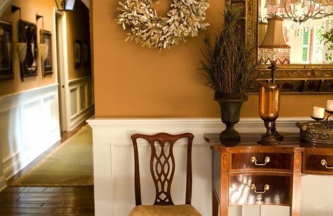
Earthy tones such as almond and chestnut not only create a cozy atmosphere for fall, but they’re also very versatile for all seasons. If you opt for a brown or tan backdrop, you might add splashes of color in accents such as pillows, rugs, and wall decor. For a toasty, rustic vibe, neutrals are a great place to start.   

If you’re feeling a bit more adventurous, you might go for the bolder colors of the season. Orange is great for adding a bit of energetic flair to your home, and it’s also a staple color of autumn. Yellow keeps things cheery and bright as we go into the cold winter months. Paint is one of the easiest ways to update your home, so don’t be afraid to get creative.

For all of your painting needs, contact the experts at University Painters. We know that your home is one of the most important elements of your life, and that a great paint job is crucial to keeping it beautiful. We’ll work with you on your preferences and your budget to achieve your color scheme goals. Visit our website at universitypainters.com, or give us a call at 1-800-390-4848.

Painter,University Painters
Written by Colleen Kalil

Giving the Illusion of More Space

There’s no doubt that one of the primary goals of home decor is to make the most of your space. Whether you’d like to make a small room feel larger, or you just want to give your home a more open, welcoming vibe, paint is the best place to start. It’s also one of the easiest ways to make any room feel bigger and brighter.

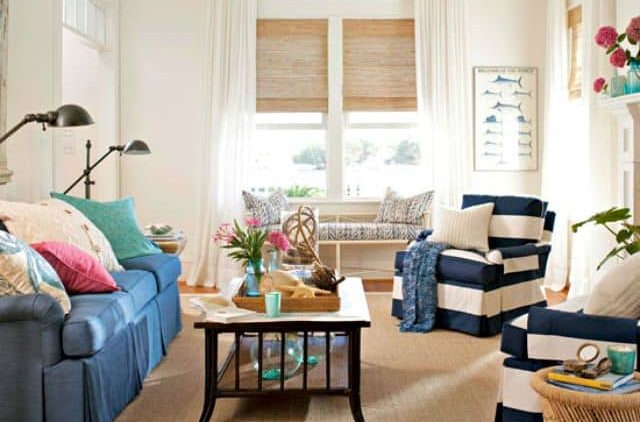
Here are some tips on how to choose the right colors for your next home makeover. Of course, white is always a good option for creating an airy, spacious effect. It reflects light and provides a pure, simplistic backdrop for any home decor changes you might make in the future. The versatility and space-optimizing benefits of white make it a smart choice for pretty much any room you can imagine.

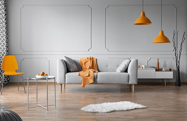
Another trick for alluding to more space is adding an accent wall. Painting one wall a bolder color than the remaining walls creates an optical illusion, as well as a strong focal point. Don’t be afraid to get creative! An accent color allows you to add a bright splash of color without committing to the shade for an entire room.

It’s also important to keep your ceiling lighter than your walls. Painting your ceilings a light color will instantly give the appearance of higher ceilings, making the room seem more open and spacious. You might also consider adding some stripes. Vertical stripes are a timeless trick for streamlining silhouettes, but have you ever thought of horizontal stripes for elongating walls? You can even experiment with contrasting colors to create depth.

Lastly, another useful tip for optimizing the space of a room is doing some color coordination. Keeping decor and accessories in the same color family as your walls gives the space a cohesive feel. Try matching rugs, furniture, lamps, and other accents to your wall color.

For all of your painting needs, trust the experts at University Painters to get the job done right. We’ll work with you on your color preferences to help you reach your home makeover goals. Call us at 1-800-390-4848, or visit us at universitypainters.com.

Paint Colors,University Painters
Written by Colleen Kalil

2020’s Anticipated Color Trends

At University Painters, we understand the importance of designing a home environment that reflects your own personality and style. If you’re considering an interior color change, take a look at the contemporary paint palettes predicted to influence home decorating trends in the new decade.

Earlier this summer, Sherwin Williams released a color forecast of 45 hues the paint company expects will make waves in 2020. The colors are divided into 5 themes, all of which are intended to evoke tranquility and joy and serve as a counterbalance to the stresses in our modern lives.

Alive—The colors in the Alive palette are deep, rich jewel tones reminiscent of brightly colored fresh fruits and vegetables. The hues are inspired by mindful living and reflect the food we choose to put into our bodies. This palette celebrates thoughtfulness, time spent with our families, and peaceful hours spent at home. Ripe olives and fresh blues are some of the hallmarks of the Alive palette.

Mantra—Mantra is intended to conjure soothing images of Scandinavian design and Japanese minimalism. This palette draws its inspiration from natural materials and includes both cool and warm tones. They are versatile neutrals that complement a range of design styles.

Play—The Play palette is just what it suggests—fun, bold, and bright colors that add sudden bursts of color and interest to a room. It’s all about leaving cares and worries behind by releasing your inner child and embracing playfulness in everyday life. Aquas, bright pinks, and gold hues all play starring roles in this joyful palette.

Haven—Harkening back to last year’s nature-based palette, Haven is inspired by the gentle tones of the natural world. Its subtle shades reflect hues of the sea, forest, and sky. This palette soothes the senses and brings nature into your home.

Heart—The final palette in the 2020 forecast includes a selection of warm neutrals and brights such as clove and soft coral that complement popular mid-century furnishing styles. They also pair well with soft earth tones.

Whichever palette best suits your own personal decorating style, University Painters can help you bring your artistic vision to life. For more information on our services or to schedule an estimate, please visit our website at https://universitypainters.com.

Paint Colors,University Painters
Written by Colleen Kalil

2019’s Top Paint Colors

If you’re considering giving your home a makeover, be sure to check out this year’s hottest new interior paint colors. Painting is one of the easiest and least expensive ways to make a big impact on your home’s overall appearance. According to Realtor Magazine, these colors are making a splash this year and may be just what you’re looking for.

Pantone Paint Company named “Living Coral” its top color for 2019. The shade is a warm, inviting blend of pink and orange with golden undertones. It’s fresh yet cozy, and using it on smaller areas will add a pop of color to any room. Living Coral is a great choice for accent walls, especially when paired with a few complimentary accessories such as throw pillows and rugs in similar shades to tie the look together.

“Blueprint,” by Behr, is a deeper, sophisticated shade of blue that’s neither dark nor overpowering. It’s part of a line of Behr paints that features a range of grays, teals, and blues. Blueprint can be described as being between navy and denim, but with a more polished and contemporary finish. Interior designers recommend layering various shades of dark and light blue decor accessories within a room for striking results.

Inspired by the earth-toned palette of the Southwest, Sherwin William’s “Cavern Clay” is reminiscent of New Mexico’s adobe pueblo dwellings. It’s a warm, terra cotta color that makes itself at home in all parts of the country. This hue can look either casual or elegant and is able to serve as a backdrop for almost any decorating style.

Benjamin Moore’s “Metropolitan Gray” is the top pick for this year’s neutral, continuing the grey trend that has been a favorite for several years. Soothing and understated, it’s an ideal neutral for those who love gray.

Whether you opt for one of these popular choices or have something different in mind, University Painters’ skilled contractors can help you achieve any color scheme you can imagine. Please give us a call or visit our website at www.universitypainters.com.

1 2 3 13