fbpx
Interior Exterior Painting
Written by Colleen Kalil

Color Choices & Your Mood

Interior Exterior PaintingYes, it’s true. Color has a psychological effect on your mood. There is an actual area of study that focuses solely on this and it’s called color psychology. Simply defined it is the study of hues ‘as a determinant of human behavior’. Color can have both positive and negative effects on individuals. Some will elicit happiness, others anger, and still others depression.

While there is no question that color can influence a person’s mood, there are a variety of factors that must be taken into consideration. For example, age, gender and culture all play a role in how a color is perceived by the individual. Some studies have shown that men find women more attractive when they are wearing the color red! Research also confirms that warm colors may invoke more of a tendency to make a spontaneous purchase! It is obvious that color psychology is complex, interesting and useful.

But what does this have to do with exterior, interior and commercial painting? Well, a lot actually. After all, when you undertake a painting project the aim is to improve the overall presentation of a room, home or business. It could generally be accepted that the outcome should be one that fosters happiness and pride. So, more than a little thought should go into the colors you choose for any paint job.

Remember that red and orange are stimulating. These are hues that must be used after much reflection and thought. Most often, they are not good color choices for the outside of a home or business, except perhaps as trim or accent. Even indoors, red and orange are powerful and should be used sparingly unless the aim of the room is to be stimulating.

Meanwhile, the color white invokes visions of cleanliness and purity. It is overwhelming the choice of color for many business and home exteriors. It gives a feeling of sterility (austerity even to some extent), so it is hardly a color to give to a room where people and family gather.

Ultimately, every color tends to evoke subtle emotions. Keep this in mind when you set out to improve your home’s appearance. Take some time and get comfortable with a color before you make it a permanent part of your residence or business.

If you have questions about residential or commercial painting, please call the experts at University Painters, Inc. for answers. Your home is our business.

house painter, exterior painter
Written by Colleen Kalil

Paint that Sells the Home

house painter, exterior painterHave you ever gone house hunting and were totally put off by an exterior or interior color that was off-putting, if not downright ugly? You’ve seen those houses painted bubble gum pink or candy cane red on the outside. It’s probably going to be the same house that has interior walls the color of a forest with neon baseboards for added interest.

Believe me when I tell you that the color of your home both inside and out can either draw prospective customers to your home if you are getting ready to sell or repel them. All indications are that if you are getting ready to sell your house, it has a better chance of moving on the market if you keep these things in mind.

Choose a color that blends well with your natural surroundings and the larger neighborhood. For example, if you live in Arizona, the overwhelming majority of homes are a shade of taupe on the outside with subtle trim and an arid, clean color on the inside. Conversely, homes in New England look better and are more likely to sell if they are a shade of white or gray with neutral trims. These colors give off a stately vibe that the potential buyer feels without having to say anything.

Blue is another popular choice for a home’s exterior, but this should be done with the same caution as choosing any other color palette. Again, a blue house would be out of place in many areas of the country. But, it would be just as much at home near a beach, especially with white trim and particularly if the color of blue is muted.

Occasionally, accent walls on the exterior of the home can provide a bold statement. It can make your house stand out while still blending into the overall neighborhood. For example, you might try a charcoal colored or indigo blue accent wall against a cream-colored house.

It’s a good idea to put some thought into the color you choose to paint your house long before you begin the process. Remember, color can draw buyers to you or send them fleeing in the other direction, even if the location is good and the price is right.

If you need some expert advice on painting your house, we here at University Painters pride ourselves on our long-standing professional service. Before you buy that first gallon of paint, give us a call. We would be delighted to work with you!

painting contractor. house painting
Written by Colleen Kalil

Mixing Brick and Exterior Color

painting contractor. house paintingA brick home offers a unique presentation. To the passerby, it can look stately. To the homeowner, it can feel like a combination of old-world charm and comfort. There was a time when the choice of brick exteriors extended only to what shade of red or chartreuse you liked. Today however, a brick home still offers the owner a variety of options to make their house look unique and stand out from the rest. This can involve either changing the color of the brick itself or the trim in complementing or contrasting pigments.

The easiest way to make a change is to paint the brick itself. This opens up a variety of choices for the homeowner. Some may prefer a muted or neutral color of paint while others may make more bold choices such as painting the brick white. The exterior of a brick home painted in white offers an entirely new and updated look. It can feel modern and chic. At the same time it opens up further options. The home’s trim can be a color that contrasts, thereby accenting and highlighting the white brick or it can remain a neutral, muted tone, such as a gray or brownish tint on the framing and door.

If you do choose to paint the brick white, take the time to look at the breadth of shades in that color. There are many toned-down whites that are not as stark, such as creams and even light beige. Some homeowners have even used a whitewash or translucent color that offers a more aged look. There are those who swear this route offers easier upkeep and a more classic appearance.

Whatever color you choose, take the extra step of painting a small portion of the house in that color prior to ‘taking the plunge’. This will help to ensure you can live with your decision before you come home to a totally new look you did not expect. Still another color that is a common choice for painting brick homes is a shade of gray. This can be equally as stunning, particularly when paired with white or charcoal trim.

Other colors that harmonize are yellow and cream, and green or black and gray. It’s up to you. And remember, if you want to keep your brick home its original color, painting the trim in a beautiful accent color can make it stand out just as much.

Whatever you choose, first choose University Painters. We are experienced in painting all types of exterior and interior surfaces and will treat your home like it’s our own!

interior painting, painters, paint colors
Written by Colleen Kalil

Color Trends for 2018-2019

interior painting, painters, paint colors
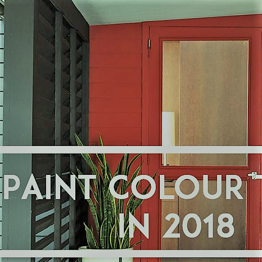
Have you ever walked into someone’s house and thought, “That color is so 1970s?” It’s easy to tell the last time a home was painted based on the color palette. While some colors are timeless, there are definite trends in color families, hue, and tone. Read on for the hottest colors for 2018 and 2019.

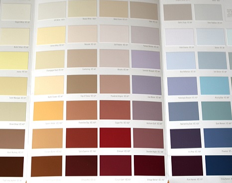
In House Beautiful’s May 2018 issue, the top five color trends for interiors were Sage, Gold, Ultra Violet, Crimson, and Teal. Bold colors are in, and it’s your chance to experiment. If you’ve never had anything except white walls, try something new. Select one, two, or more colors you’d like to try and paint a 2′ x 2′ area on the wall. Paint color often dries darker than it appears in the can. You’ll also want to see it at different times of the day.

Trends for 2019 are a bit more subtle, but they’re still not typical. Hazelnut, Lilac, Gray, Dark Green, and pastels are at the top of the list for color choices. The choices you make will depend on the style of your home, the room’s purpose, and your personal taste. Color psychology is a great way to guide your choice.

Colors in the red-orange family are warm and stimulate Purple your senses. While reds are associated with danger or caution, they convey power and energy. Orange is also energetic but in a lighter way than red. Yellow has a feeling of joy, brightness, and happiness. Children whose favorite color is yellow tend to be happier and more positive.

Blue and green represent nature, freshness, and growth, but also stability and safety. Most shades of green are calming colors, good choices for bedrooms or the living room. The lighter the colors in this palette, the more soothing the effect.

The color of royalty, purple has gained in popularity over the last few years. Purple represents wealth, luxury, and creativity.

White is a timeless classic and ranges from bright white to eggshell. White symbolizes purity, goodness, and cleanliness. It’s an excellent neutral if your furnishings have busy patterns or bold colors. Be careful when choosing bright whites. Depending on the light source and lighting in your home, it can appear harsh.

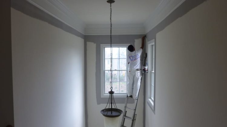
No matter what your color preferences are, the experts at University Painters can help you select the right color for you and apply it to perfection. Call us or go online for an appointment.

paints, home painters
Written by Colleen Kalil

Choosing A Paint Palette For Open Floor Plans

paints, home paintersOpen concept floor plans continue to be a favorite among homebuyers. The flow from room to room creates a large, inviting space for friends and family to gather, and without walls separating rooms, the area feels larger and more spacious. However, the large space can present decorating challenges. How do you create a unified color scheme? Use too many colors and the space will feel chaotic and be visibly unappealing. Use too few colors and it may be boring.

One option is to create a palette using three to five colors. Five colors may sound like a lot, but the key is how each color is used throughout the space. Choose one neutral color: white, off-white, or eggshell are good choices. Next, select one or two other light colors, and finally, select one or two accent colors. Keep your choices within color families to create a sophisticated, professional appearance. Whichever colors you choose, be consistent when applying them to your rooms.

Use your neutral color as a base and apply to the majority of the space. The neutral color provides a blank canvas where you can add different accents, textures, and materials. Add interest to different areas of the space with an accent wall. Don’t be afraid to be bold. Remember, dark colors make objects recede, light colors make objects look bigger. Add color to the inside of a built-in bookcase, the wall over a fireplace, or an interesting architectural detail.

A three color palette is a simpler plan. Use one color for the walls, the second for the trim, and the third for the ceiling. Again, make sure colors coordinate to create a refined interior.

Tone-on-tone or monochromatic palettes offer more variety than you might think. Use different tones of the same color, either in one room or as a smooth transition between rooms. The different tones don’t have to come just from paint. Add wallpaper, stenciled designs, fabric, glass tile, etc. to create interest and texture.

Don’t forget that textiles and furniture are part of creating a cohesive space. If you’re a fan of hardwood floors, select a neutral that works well with your color palette and furniture style. Layer area rugs, architectural details, and artwork to create depth and add interest to your space.

University Painters expert technicians can help you develop the right color palette to create the mood that’s right for your home. Call us today for more information and to set up a free consultation.

Exterior Painting, Home Painters
Written by Colleen Kalil

Get Your Backyard Event Ready

During the warmer months of the year, people want to spend more time outdoors, not just relaxing but also celebrating with friends and family. Whether the gathering is a casual barbeque, a child’s birthday party, or a wedding, everything should look fresh and inviting.

If your home has been the same color for the past decade, consider giving the exterior a refresh with a new combination of colors. Every year, the people at the Pantone Color Institute select a color of the year, which influences the fields of fashion, design, and home décor. The color for 2018 is Ultra Violet, and while the exterior of your home may not be the place for a pop of this vibrant color, there are other palettes that are currently trending.

Before painting, consider the environment around your home. Do you live in a wooded area, downtown, or a more traditional suburban setting? How will the new color fit in with other homes in your neighborhood? The answer to these questions will help you choose the best color scheme for your home. The first step is to select the main color, and then add accent colors. Don’t go overboard with the number of accent colors or you may end up with what looks like a Jackson Pollock painting rather than a fresh, updated exterior.

Exterior colors now trending are gray-blue, pale yellow, Cyprus green, peach, forest green, and red. If you select a bold color like red, keep the trim simple and add a complementary color to the front door. If you absolutely love white as the main color for your home, try updating the accents to forest green, gray-blue, or navy blue. If you live in a lush, forest environment, yellow or peach are options to make your home stand out but not overpower the flora.

If you have a few ideas but need help making your final color choices, contact University Painters. We can help you develop the right color palette for your home. Contact us today so we can help you get prepared for your next backyard event.

painters, paint colors, interior painting
Written by Colleen Kalil

4 Color Themes To Make A Small Room Appear Larger

interior painting, painters,paint colors has the ability to make a room appear larger or smaller. The right colors can make even the smallest rooms seem bright and airy. By pairing bright hues with contrasting darker shades, you can instantly add space to your room.

White With Accents

White rooms are easy to work with because they look good with any accent color. You can pair it with dark and dramatic colors. You can paint a white accent wall without making your room look tiny.

Don’t be afraid to experiment with color. Try a black-and-white checkerboard wall. Paint coral and turquoise for that touch of beach flavor or paint an entire wall fire-engine red or cobalt blue. As long as the other three walls are bright white, your room will look large and spacious.

Sunny Cheery Colors

Yellow and orange are great additions to small rooms. The best shades to use are soft yellow, pale yellow, butter, lemon, or banana. When it comes to orange, use sherbet or pastel orange. It’s better to use these colors with dark tones if your room is narrow.

Paint your wall with vertical stripes. This will create the illusion of a longer room. Add some fun color elements with lime green and sorbet orange.

Under The Sea

This next idea is great for a children’s bedroom. Sea foam green, light blues, and soft greens are relaxing colors that enlarge your space. Plus, you can mix them with reds, corals, blues, whites, and other colors. Paint your accent wall emerald green or forest green for that pop of color.

Blue is another color that helps widen a room. It looks great with white walls and light carpeting. Keep your window treatments and trimmings white to add more space to an already small room.

Easter Egg Colors

Pastel colors aren’t reserved for spring and kids. These hues can make any space appear bigger. Use touches of lavender, lilac, soft pink, baby blue, mint green, and peach. Break up the colors by painting your walls beige, tan, or cream. Paint your door and window frames in similar neutral tones.

Add accents to your room with darker shades in the same spectrum. Some fashionable accents include rugs, blankets, and throw pillows.

That’s not all. Use plenty of natural light and mirrors to help open up the space in your room. Don’t want to do yourself? University Painters have years of expertise when it comes to interior painting. Call us today to add a fresh coat of paint to a space in your home.

interior painting,home painters
Written by Colleen Kalil

Painting Your Walls With These Colors Can Brighten Up Your Mood

Are you redecorating or looking to freshen up a space in your home? Are you looking for the right paint color to boost your mood? Choosing the right color can be a challenge, especially when you want different shades in different rooms. You don’t want your home to be the same color throughout.

The bedroom, for example, should be a calming and relaxing oasis where you get away from it all. Meanwhile, the dining room should make you feel alive and social. Sometimes white and off-white doesn’t always cut it. Try out some of these colors to improve your mood.

Blue

Blue is a popular shade because it’s so calming and relaxing. It helps devoted yogis to stay centered and focused. Blue can lower your blood pressure, clear your mind, and help steady your breathing. It’s perfect to use in a room where you meditate, lounge and rest, or practice yoga often.

White

Believe it or not, white is a tried and true color. Some people are afraid to paint their walls white because it can attract dust and dirt. Painting your home white will make it look more open and inviting. While it’s not a calm or relaxing color, white can make you feel happy and clean.

Yellow

Liven up your home with bright sunny yellow. Nothing is more joyful than walking into a yellow kitchen early in the morning. Most people are drawn to yellow because it represents the sun’s rays. Use it in rooms where you entertain your family and friends such as the breakfast room, kitchen, or sun room. However, if you have severe anxiety, you may want to choose a softer hue.

Green

This color is perfect for your office as it can reduce anxiety and promote prosperity. When most people think of green, they think of emerald green or bright green. This shade comes in relaxing hues that’s gentler on your eyes and is known to be calming and soothing. For those who love the great outdoors but live in the city, they may choose to use blue-green or forest green.

Red

You can use red as an accent color or all over your walls. Some people find red too loud in large amounts. Use a softer shade in a room where you and your family frequent the most. It’s a perfect color for socializing with your friends and family, especially around the holiday season.

Need a fresh coat of paint in your home? Contact University Painters today to find out about our interior painting services. We can bring new life and help improve your mood. Call our estimators to get a quote on your next interior painting project.

interior painting,, home painters
Written by Colleen Kalil

Choosing The Right Interior Paint For Your Home

Choosing the right paint color isn’t always a fun process. You can make it easier when you know exactly what you’re looking for. Deciding on the right paint color takes a little research, but it’ll make your interior painting project a whole lot easier.

You’ll probably end up with a few different color shades that you want to use. Here are some tips for choosing the right paint color that will help you avoid making a costly mistake. 

Read More
1 2 3